Got a business card? How’s that working for you? Does it work hard to bring you people who are ready to buy? Is it so valuable that your prospects will photocopy it to share with their friends?
Or… does your business card just look pretty, kill trees, say nothing new and end up in a pile with 100 other business cards… or in the trash?
Let’s fix that today.
I’m going to share how to take an ordinary 8.5″ x 11″ Letter size paper and make it at least 9x more profitable than any business card — just by adding some black and white text.
But first, this important truth:
“We can only connect the dots we collect.”
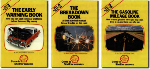
Inspiration is all around you. You’ll often learn more by observing than by locking yourself in a room and brainstorming. Today’s piece is swiped from the Shell Answer Books by Ogilvy & Mather:
From 1976 to 1982, Ogilvy & Mather’s “Come to Shell for Answers” campaign ran in a series of television commercials and print advertisements. National magazines also carried booklet inserts that offered tips on everything from getting better gas mileage to fixing a flat to avoiding danger on the highways. These came to be known as Shell answer booklets—there were 21 in all—but the most popular feature of the campaign was the Shell Answer Man. In fact, to most members of the public, “Shell Answer Man” was the name of the campaign. Certainly he gave it a face, albeit a fairly anonymous one. Dressed in the clothing of a service station mechanic—with a Shell logo prominently displayed on his uniform, of course-the Shell Answer Man was friendly, knowledgeable, helpful, and clean. Even though the Shell Answer Man spent his time handling motor oil and tire irons, he managed to look bright and chipper under all circumstances. “During his 1976-82 heyday,” wrote Lisa Paikowski in Adweek, “the Answer Man—an otherwise nameless spokescharacter—was Ogilvy & Mather’s answer to corporate oil company advertising in an often difficult environment. Over the seven years, Houston-based Shell distributed more than 1 billion booklets, chock-full of automotive tips, via magazine inserts, its gas stations, and mail. So popular were the booklets that eight years after the Answer Man campaign ended, Shell was still getting requests for them.” (from warc.com)
The campaign brought in 900 million visitors into Shell stations across the country. There are not even 300 million people in the U.S. This meant that the books brought some people in multiple times.
Let’s not forget: this is for GASOLINE. A commodity. Your car can run on gas from any station. So how can you make people drive out of their way to one gas station over another?
By making it about something more than the commodity product. Copywriting legend Gary Bencivenga said in his retirement seminar, “When in doubt, sell information.”
So, if this strategy can work for a commodity like GAS, surely it could also work for moms in need of lactation help, since it involves a human being they care about the most in the world, even more than themselves.
OK. Are you ready to see some magic? I’ll be taking this idea from an oil company and transforming it for lactation services. WHAT? Yes. Breastfeeding. And we’re going to get technical. I’m going to usher you past the velvet rope, behind the curtains, to deconstruct the “Breastfeeding Answer Booklets” series I created with Melisa, a mom, Lactation Consultant and owner of I Love Breastfeeding:
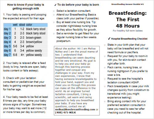
Answer Booklet 1 (outside)
This is a tri-fold brochure with 6 panels (3 panels on each side). The brochure was designed to work even when photocopied black and white using standard equipment at any business premises — a benefit I’ll explain later.
It is intentionally simple. Anything fancy would take longer, involve more people, cost more, and be harder to produce… and it’s not even clear if fancier will yield better results. So, this first run is a quick and cheap test, to set the baseline that future iterations must prove themselves against.
The goal of the brochure is to provide answers to her prospects’ most pressing questions. And by doing so, this piece becomes too valuable to throw away or ignore, when presented to the ideal prospect. The tone is friendly, yet unbiased and factual. It’s not too edgy, because we want doctors to feel comfortable giving them away to their patients.
The headline makes it clear it’s about “Breastfeeding”, so no one will pick this up unless they are (or know) a breastfeeding mom. By tracking how many brochures are picked up, and assuming that they’re only picked up by a household with a breastfeeding mom, you can compute how profitable this campaign is by the number of inquiries originating from the brochures.
The next part of the headline is equally important: “The First 48 hours”. This implies that something needs to be done in the very specific time frame of 48 hours after a baby is born. Expecting moms worry. They want the best for their baby, so this motivates them to at least peek inside, to make sure they got everything covered.
The first step to getting any piece read is to get it opened.
So next, it opens with a checklist. Why a checklist? Because once you start reading a checklist, you can’t stop. We need to read to the end of the list to make sure we got it all. And since it’s not clear if this checklist continues into the second page, if you got this far, you must open the brochure:

Answer Booklet 1 (inside)
Pictures! Eyes go to those first. After your reader gets oriented, she’ll see the “How to…” headlines. This creates the perception that the piece contains valuable instruction. Again, all paragraphs are structured as lists. This makes it very difficult to skim, or stop reading once you start.
On the back (middle) panel of the outside pages, the brochure ends with a “To do” list. And below that, a half page bio and short personal letter to the reader, inviting her to contact with multiple ways to reply (phone and email).
“Why the personal letter?” you might be ask. Why not save space and just state phone and email? Because it is the most important part. People connect with people, not printed text on paper. A personal letter puts a face, voice a fellow mother behind the facts presented. The more you give your reader a piece of yourself, the more they have to connect with you. And you give them more reasons to trust you over someone else. (“Don’t trust strangers.”)
Here’s the 2nd Answer Booklet:
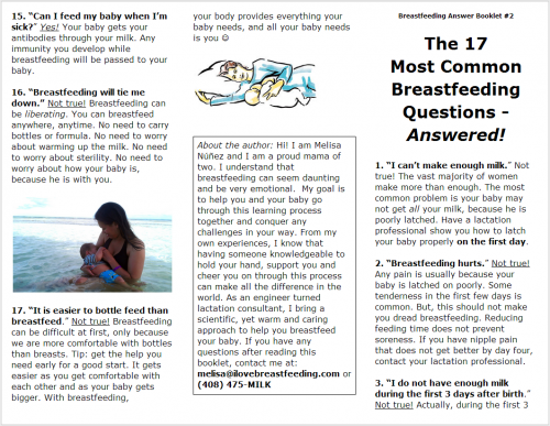
Answer Booklet 2 (outside)
The number “17” was intentionally included in the title. This adds specificity, and creates the expectation that there is a list 17 items long inside. Like the 1st booklet, since expecting moms have many questions, this gives them instant value by not only identifying which are the “most important” questions, but providing the best answers all in one handy place too.
The front page features the 3 most common (and important questions) breastfeeding moms ask. The 3rd question is intentionally cut off, so you have to open it to read the rest. What doesn’t get opened doesn’t get read.
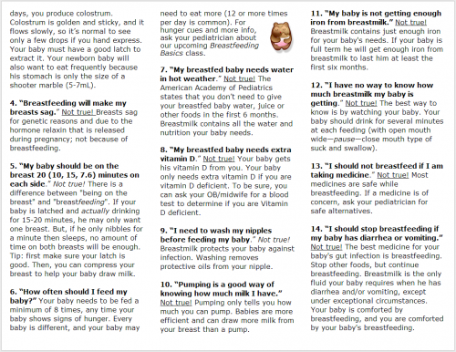
Answer Booklet 2 (inside)
The structure is a big list, like the previous booklet. Question 4 was intentionally placed as the first question on the inside — not because it’s that important — but because it catches your attention. A tiny picture in the middle provides eye relief, breaks up the text, draws the eye to that paragraph about an upcoming class and adds an emotional touch.
Wherever possible, we used words like “you”, “your”, “your baby”, etc, instead of “the mother”, “the baby”, “most moms”, etc. And simple words were used instead of technical jargon.
Back to the outside (back page), the questions placed there are also deliberate. They are more aspirational, and emotional, because we want to transition the reader from logic to heart by the time we introduce ourselves. This makes it more likely for the reader to associate Melisa with feelings of happiness, hope, and success.
Also, you have to consider that when the brochure is picked up folded, all you see is the outside page. So, you want to present a positive picture on the outside panels.
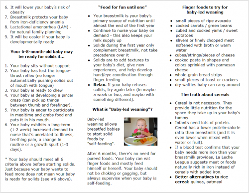
Next, Booklet #3 was created for a specific segment of breastfeeding moms: moms who want to transition to solid foods. These will go to wherever those moms may be at that stage of their life. For example, pediatricians’ offices. (Moms who visit pediatricians have older babies.) Also, at promotions for moms with toddlers. Melisa hosts the local Big Latch On every year on World Breastfeeding Week. Answer Booklet #3 will go into the goodie bags given to breastfeeding moms participating in the world record attempt.
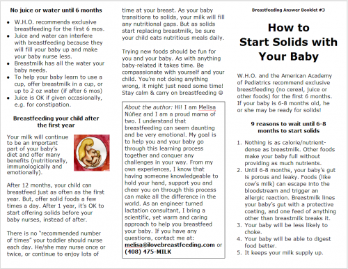
Answer Booklet #3 (outside)
Accurate targeting of your message to your audience makes your reader feel “this is for me and me alone.” It stands out and becomes difficult to ignore because it “enters the conversation going on in her head” and solves the problem at the top of her mind. Accurate targeting also gives you accurate tracking. It reveals exactly which marketing pieces work best, and which of the people you serve is the hungriest.
Answer Booklet #3 (inside)
*** PHEW! ***
Congratulations! Pat yourself on the back and give yourself a high-five. You must be a great student if you’re still with me this far.
Can you see how this is more valuable than a business card? When you present a business card, the transaction says it’s all about “me me me me.” With something like this, you’re starting the relationship with generosity. You’re giving a gift that says I know where you’re coming from; this might help you now. Not sometime in the future, right now — right after reading this, you will feel the instant relief of questions answered, doubts cleared, and knowing that someone is on your side and there’s someone you can go to if you ever need anything. Everything will be okay. You’re safe now.
Then, 3 magical things happen: Proof — your information demonstrates your authority and expertise, and by providing some instant relief, it’s proof that what you know works. Trust — they’re more likely to trust you because you’re showing that you care about them, you’ve proven that you’re an expert and what you know works, and you’ve offered a personal touch that makes them feel like they know you more than a stranger. Also, if your information appears as an endorsement from a business they already trust (like in a doctor’s new patient packet), that trust transfers to you. Reciprocity — you started the relationship with generosity, so your reader will be more likely to respond to your positive action with a positive action.
Now compare this to a business card. Imagine if you gave your prospect this, and they got a business card from someone else, who do you think will remember? Who do you think they will call first? Exactly.
It’s also a powerful conversation starter:
Breastfeeding mom – “I’m keeping this chart in my bag!”
Children’s Dentist – “Maybe I should have a pamphlet too!”
Pediatrician – “Can we make copies of this to include with our new patient packets?”
See, it even opens doors for partnerships and other opportunities.
There’s another bonus: people are more likely to share valuable information than they are to pass along your business card. Consider this: if we had simply approached pediatricians with a business card, there was no chance they’d pass it along to their patients. But because the brochure provided valuable information to their patients, not only did they offer to photocopy the brochure and distribute it for free, they didn’t even mind that there was a 1/3-page bio and “ad” in the back. There aren’t many endorsements more powerful than from a person with a white coat.
Remember: the best ads don’t look like ads. The best ads provide instant value. And the best ads are too valuable to throw away.
Can this piece be improved? Sure. You can spend the rest of your life making something better. But Winston Churchill warned, “Perfection is spelled p-a-r-a-l-y-s-i-s.” Good enough is good enough.
Anyway, to improve any piece you have, here’s one tip: Make an irresistible offer. Compel your reader to reply right now. You don’t have to ask them to buy right now. But have your reader do something to raise his/her hand. Then, capture his/her contact information and follow up.
That’s it for today’s “dot”. (“We can only connect the dots we collect.”) Before you dismiss it as irrelevant for your business, remember that this is a general principle: “When in doubt, sell information.” You’ve just seen this principle used for gasoline (a commodity), then adapted for the “new mom” community!
On a deeper level, this is about starting your relationship with your potential clients or customers by being generous. You start by giving them instant improvement in their life, instead of making it about you.
“What helps people helps business.”
– Leo Burnett
Your turn: How will you use this for your business?


3 comments
Wow, just found all 32 of the Shell Answer books. Didn’t realize it was that long ago.
I got them all and still have them. What should I do with all of them ?
Very informitive little books, The Shell Answer Man….
Anyone interested in having them ? Brand new condition, only read once as we speak.
They will however have been read twice soon, as I plan on refreshing my memorry.
People might think the “Shell Answer Man” is cheesy today, which is too bad. They were good (and useful) books. I searched eBay for you and found that a set of #1-#13 of those books sold for only $6.99 in April 2013 (http://ebay.eu/1aXUgsN) 🙁 So I guess the information in the books is more valuable than the books themselves.
I have all 32 Shell Answer Books, found them cleaning out a closet.
Good read